Public Transport of Victoria App Redesigned
.jpg)
Problem Statement:
Redesigning Melbourne’s PTV app to fix usability issues and deliver a simple, intuitive public transport experience.
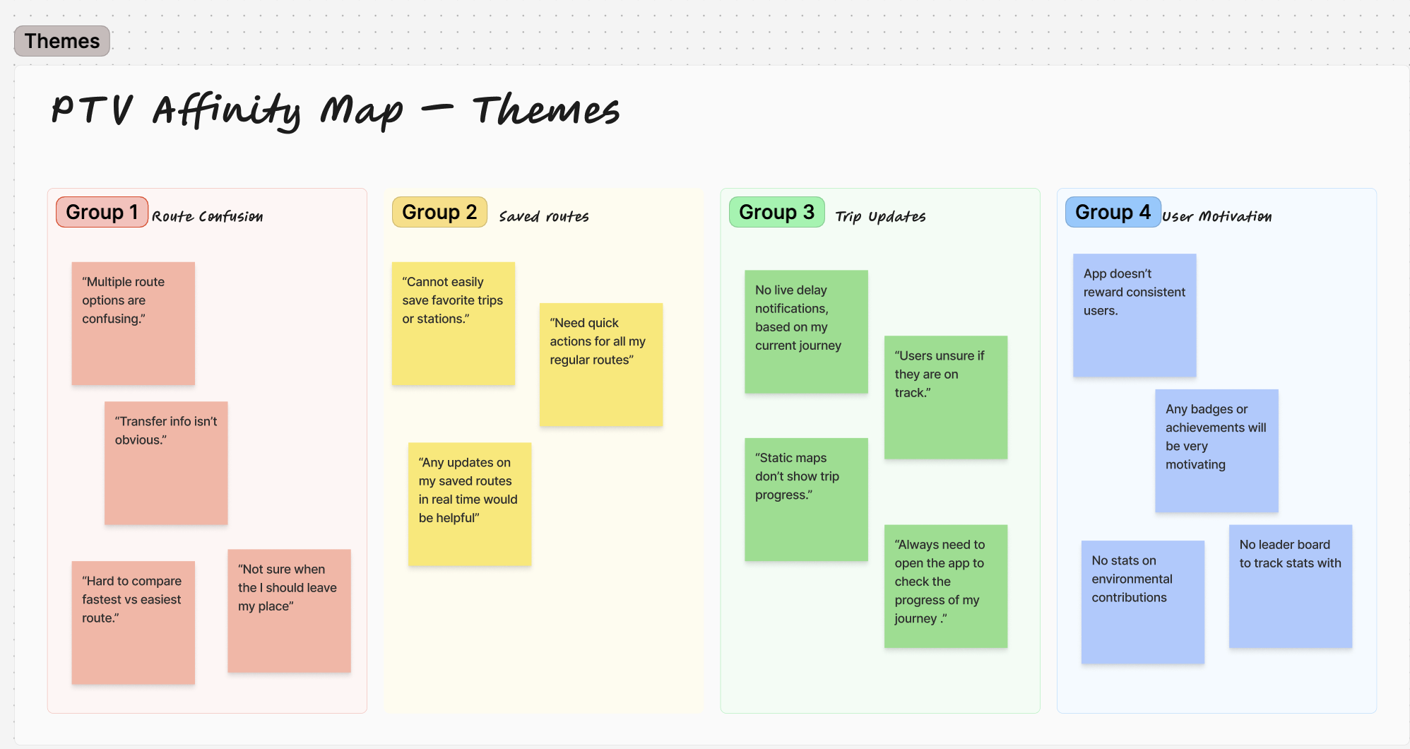
Research & Insights
- Simplify journey planning and live tracking
- Improve accessibility and readability for all users
- Increase app engagement and retention
- Reduce user errors and complaints

.png)
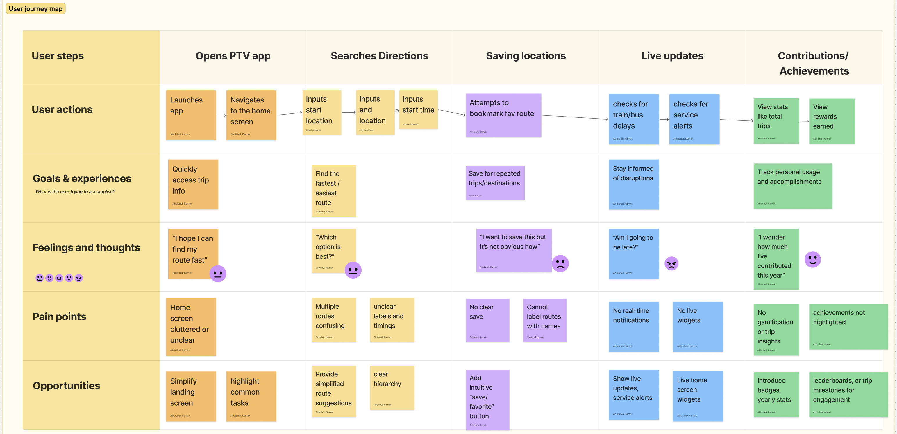
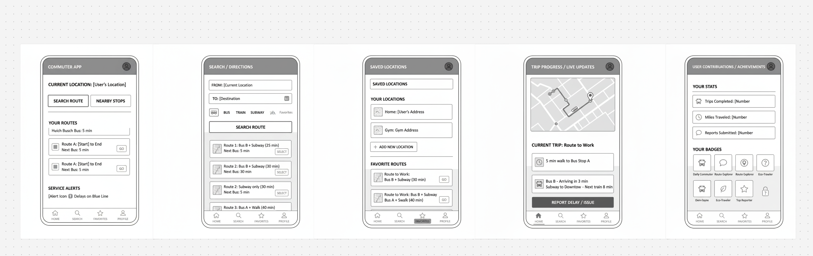
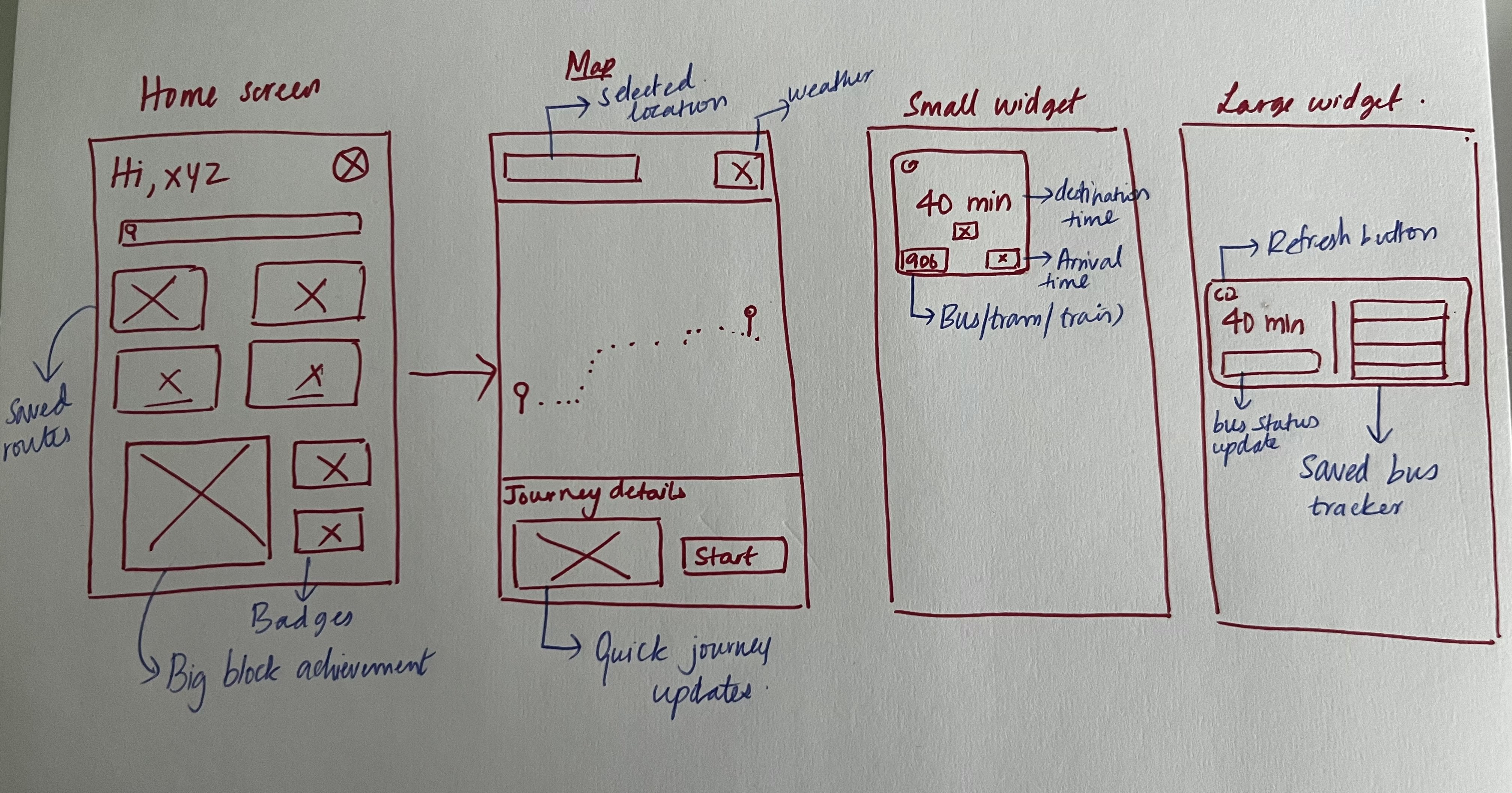
Planning & iteration
I began by sketching user flows to uncover where commuters struggled most. Early drafts revealed pain points around searching for routes and the lack of reliable live updates. Through low-fidelity wireframes, I tested simpler layouts and ways to surface real-time data. Each round of iteration refined the design, moving from rough ideas to clear solutions that made journey planning faster and more intuitive.
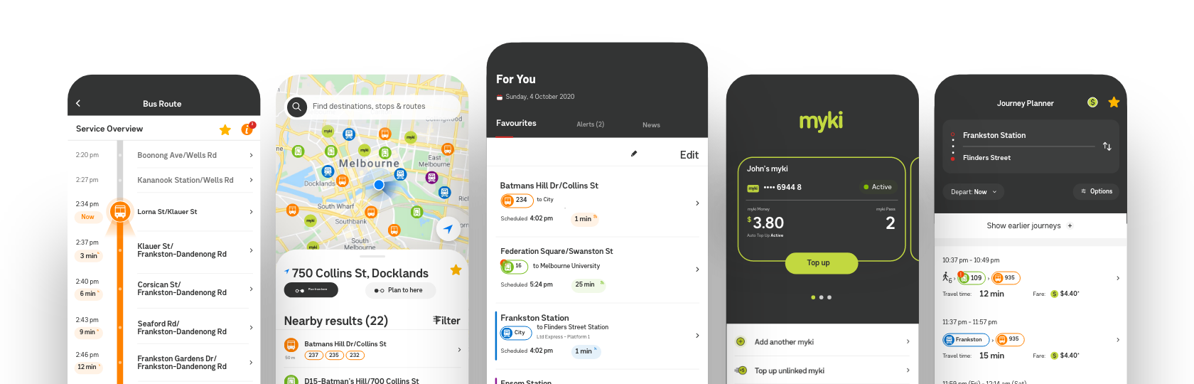
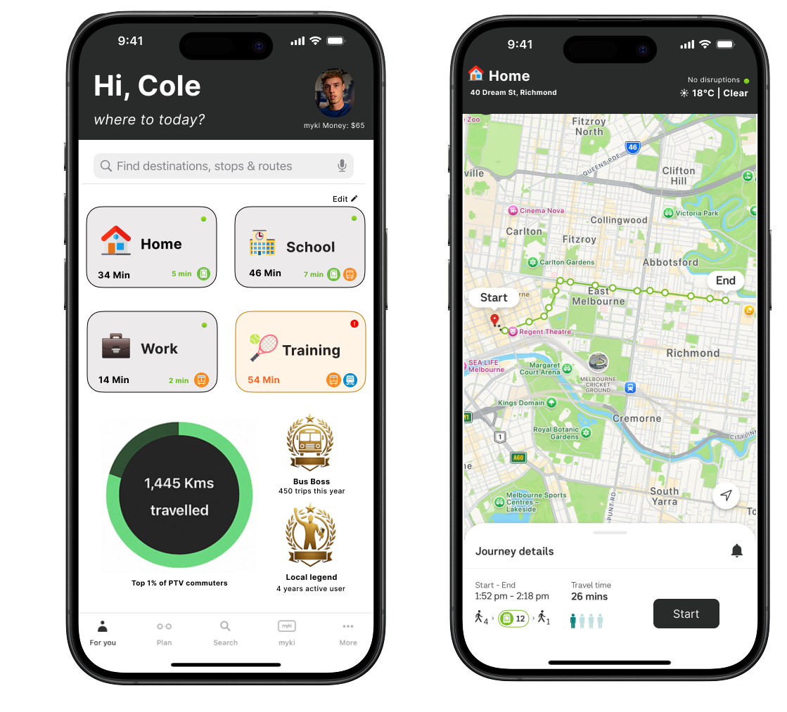
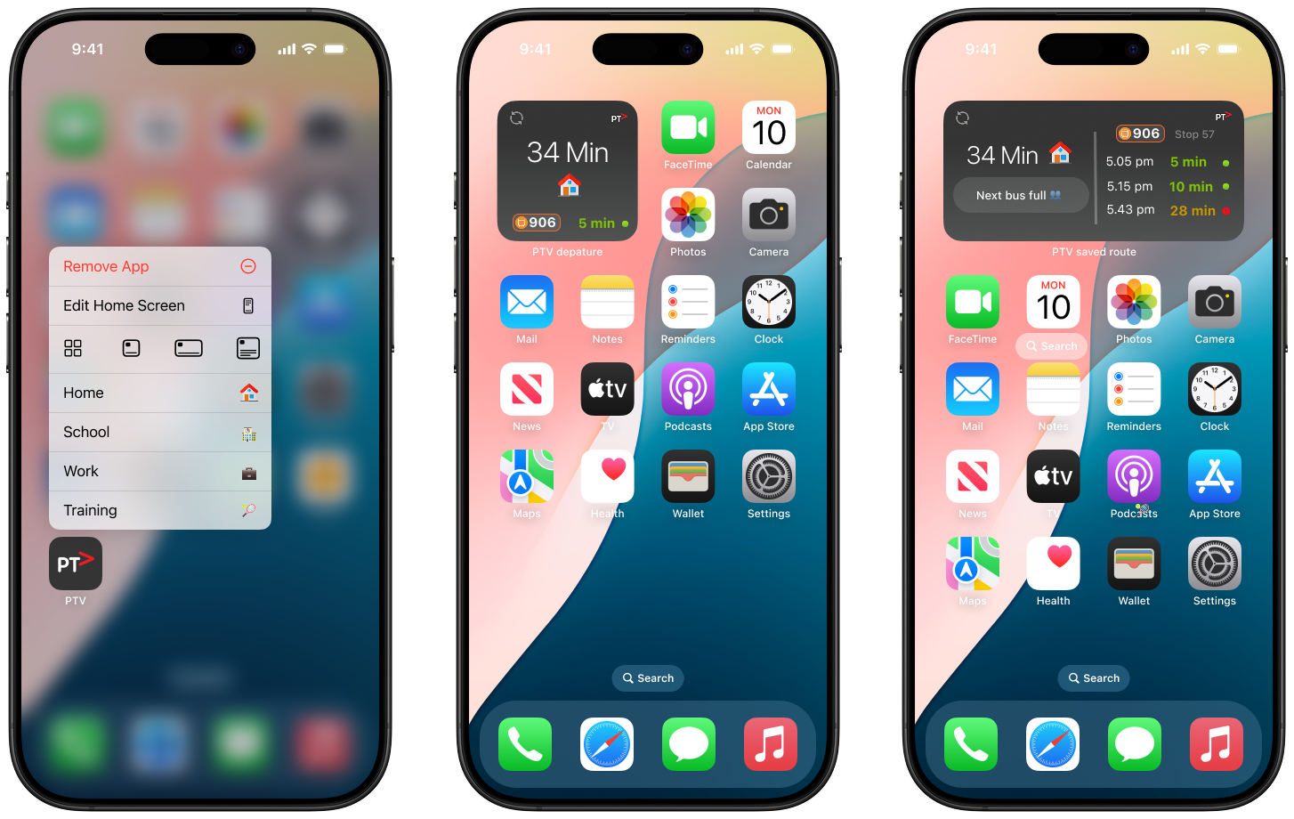
Design Execution
With the refined wireframe as the foundation, I built the high-fidelity designs. The focus was on clarity, clean navigation, stronger emphasis on live updates, and a modern visual system that aligned with commuter needs. Each UI component was purposefully chosen to create a seamless flow, ensuring the final app felt intuitive, reliable, and ready for real-world use.
.jpg)

From confusion to clarity, PTV reimagined.
Impact
Achieved 100% positive feedback from 25+ test users across diverse demographics, validating both usability and engagement improvements. The widget system significantly increased real-time usage, while gamification boosted overall user satisfaction and retention.
.png)